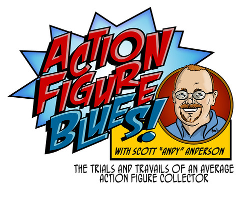
I've been thinking of giving the sites a spruce up for awhile, and started by doing some cleaning up and redesigning of the body of the blog at the beginning of the year with help from our friend dozymuppet, as I am moderately HTML-disabled. Once I'd done that I had an idea in my mind of a new logo that might suit the new look.
I have many skills, but when it comes to logo design and all that graphic-y stuff (note the technical language) are not in my skill set, so I rely on the skills of others, which is just one of the reasons I keep company with a wide range of talented folk such as the capricious Coffee Joe and the bombastic Burn, who respectively designed the last two fantastic incarnations of the AFB logo.
The idea for the new logo crystalised in my mind when I had my good and extremely talented friend Matt "Mirthquake" Orsman do one of his famous "Mirthtoons" of yours truly (check out Mirth's Facebook Page to see more of his work). It was initially for more of a lark than anything, but once I saw it, I realised how great it would looked tagged to the end of a new, Mirthquake-designed, AFB logo! It didn't take Mirth long to whip up the amazing treat you see above, alongside the forum logo and the smaller version in this post.
Adding the Mirthtoon to the logo is a great way of clearing up any confusion that's been caused by my online name and my real one. I chose "Andy" as an online name many moons ago because it was a derivative of my surname, but as so many people have come to know me by that name, they often get a surprise when I sign off an email or message as "Scott". Now you can see it's all the same me!
I'm over the moon with the great job Mirth has done, and I hope that you like the change. Mirth does his Mirthtoons for hire, and you can get in touch with him through his Facebook page above if you'd like your own. He's a real talent!
Let me know what you think about the new AFB look! You can discuss this at the AFB Forum, and you can also comment on this post to enter the June AFB Comment of the Month Contest!
Until next time!


3 comments:
Love it!
great job!!! now the blog has a consistent look, i think this is not only a touch up, but a coherent design intervention... welcome to the club of good-looking blogs (very exclusive i must say XD)
Looks GREAT!
Post a Comment