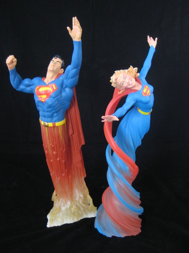
 One of the pleasant surprises to come out of DC Direct in recent times has been the Tim Bruckner-sculpted DC Dynamics Statue Series. I have previously purchased and reviewed the Aquaman , Batman and Wonder Woman editions and was very pleased with all of them. Of the statues following those three, I’d only ordered Supergirl, but I recently picked up Green Lantern and Superman at a sale, so we’re looking all three of them this evening!
I was immediately taken with the promo shots of the DC Dynamics Supergirl Statue because it’s the Silver Age (read: Legion of Superheroes) version of the Maid of Steel. I have a feeling this is going to put many modern-age centric collectors off this piece, but for me it was the selling point.
Aside from the Silver Age goodness of this statue, what I really love is the pose. While most of the poses in this line are more focused on looking powerful or majestic, this statue looks like a young superheroine playfully reveling in her powers, which is exactly what a young Kara Zor-El should be doing. Not often do we get the kind of clear representation of pure joy that Tim Bruckner has delivered with this sculpt.
This playfulness, and the headsculpt that is decidedly focused on presenting a young girl as opposed to an oversexualised vamp, really appeal to me. I particularly love the wisps of hair over Supergirl’s face. It’s nice to see her original uniform as well. I’ve got nothing against the female form – in fact I’m quite a fan of it - but I don’t need the sexuality of every female character to the be the overriding force in a statue. Having a great-looking piece representing a female character that isn’t spilling out of her uniform is actually quite refreshing! Again, there’s a place for it with certain characters, but it’s nice to see that pieces can also work very well without it.
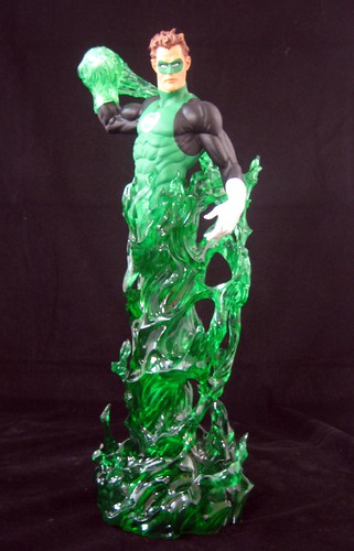
Amidst the deluge of Green Lantern merchandise out and about at the moment, the solicitation for the DC Dynamics Green Lantern Statue passed me by a bit. In person though, it really stands out. It’s a Silver Age Hal Jordan, and I particularly like what Bruckner has done here with the headsculpt. There is something distinctive about the way he sculpts Hal’s head that makes it instantly recognizable to me, and while I can’t put my finger on exactly what it is, I like it!
This is a taller piece, and more slender than some of the others. Thanks to this, it makes a nice central point in a display of the group of statues in the line.
Alongside the pyre of green energy that makes the base of this statue, Bruckner gives us a little extra in the form of a green energy “ball” surrounding Hal’s right hand, ready to be thrown. This is semi-transparent, and you can see his white-gloved hand underneath. A very nice touch to cap off an excellent statue!
Lest you think this report is all glowing, there is a slight down side. The Superman release in the DC Dynamics line is by no means disappointing, but it’s my least favourite to date. I quite like the more angular base, which is a clever interpretation of Superman’s power into the format. It’s the face of a piece that can often win or lose me, however, and in this case the headsculpt leaves the overall effect of the statue lacking.
One thing that often annoys me about a statue is if the character’s face is looking too far up or down to be seen clearly when displayed. This is often hard to tell until you actually have the piece in hand, as the way that some pieces are photographed can be quite misleading as to the actual angle at which the piece stands. I don’t think that’s particularly the case here, but Supes is looking up a little to far for my liking.
 The direction of his gaze would probably be okay if he had a particular look of determination on his face, as if he was keen to get to his destination or ready to punch someone up good. In this case though, the expression is all a bit too blank, so it makes the upward stare a detractor for me. It’s a shame too, because the more I look at the base, with it’s excellent depiction of Superman taking off at speed, the more I want to like the whole package.
Something that impresses me about the line as a whole is that despite the height of these statues being much greater than the width, they’re fairly stable. That’s certainly something you want in a statue and may seem a bit obvious to comment on, but it could be a potential concern with these, particularly considering that the bases are hollow inside. I don’t know how well they would stand up to a “cat leaping on shelves” test, and I’m not about to experiment, but their general stability is excellent.
One of the main criticisms I hear of this line is that it’s “like paying for half a statue”, but I think that’s missing the point of the series. It’s a very different concept that is either going to appeal or not appeal, and as someone who is attracted to the designs I think this line is one of the more exciting things to happen statue wise in recent times. They are at the pricier end of statues at the scale, so it’s not the sort of thing you can collect halfheartedly, but I’m learning more and more to only order up front the things I absolutely have to have, as most other items can be found either on sale or on the secondary market for reasonable prices later down the line.
That will be it on DC Dynamic for a little while, but not forever. I’m not terribly into statues of busts of villains on their own, and will be skipping the upcoming Sinestro statue, which is next in line, but I’ve ordered the Joker version as it’s just spectacular looking. It’s nice to see the line expanded beyond the original six statues, and I’d love to see DCD throw a “B” list character or two into the line just for fun!
You can see more pics at Facebook, discuss this at the AFB Forum, and comment on this post to enter the March AFB Comment of the Month Contest!
Also, don’t forget to check out the two contests we have going at the moment: the “That ‘70s Custom” Custom Contest and our first “Toy Lines!” Caption Contest!
Until next time!

3 comments:
i think all these statues r beautiful & the dynamic sensation (the main concept of the line) is perfectly represented... actually the "blank expression" in Superman’s face wouldn’t b a problem if u wouldn’t hav the other statues of the line around him... The Hal’s statue is the winner for me here...
Damn. I'm a little weirded out by the way all of their bases connect to their upper torsos in some way. It's like the floor is sucking them into the ground.
I remember when Supergirl was solicited, I was interested in it, but the pics I saw of the face was so bad, that I could never order it. I like the dynamic part of the base, though. Why is Hal's so tall?
Post a Comment